Case Study - 2015 to 2020
HICKIES — Everything Digital, From the Ground Up.
COMPANYHICKIES, Inc.
ROLEDigital Designer
SCOPEEnd-to-End Digital Design
DURATION5 years
OVERVIEWA product with purpose. A brand without a system.
HICKIES made a genuinely useful thing: a no-tie elastic lacing system that transformed any sneaker into a slip-on. What started as a Kickstarter idea from two founders in Brooklyn grew into an internationally distributed consumer brand carried in retailers across five continents.
But when I joined in 2015, the digital experience hadn't kept pace with the product's ambition. The website was fragmented. The brand lacked a coherent visual language across digital touchpoints. The user experience was inconsistent from the homepage to the checkout. As the company expanded the product line (Kids, Metallics, Swarovski, DooHICKIES Charms), the need for a scalable design foundation became necessary.
I joined as HICKIES’ first dedicated digital design hire, starting as a junior designer and growing into ownership of the full digital experience. Over five years, I built and scaled a complete digital design system across two platforms, consumer retail and B2B wholesale.
THE CHALLENGEThree products, two audiences, one designer to hold it all together.
The core challenge was systemic. HICKIES needed a design language that could hold together an expanding product catalog, serve both direct consumers and wholesale distributors, scale across desktop and mobile, and stay coherent as the brand entered new markets and product categories.
There was also a product communication problem unique to HICKIES. The lacing system replaced something every customer already thought they understood. Communicating a better way to do something people assume they've already mastered is hard. Every design decision, from information hierarchy to interaction flow, had to earn the customer's curiosity before it could earn their purchase.
SCOPE OF WORK
Every digital touchpoint and user state.
Design System
UI Style Guide
Typography Scale
Color System
Component Library
Iconography
B2C Platform
Homepage
Product Listing Pages
Product Detail Pages
Bundle Builder Flow
Custom Fit Quiz
Cart & Side Cart
B2B Platform
HICKIES Network Portal
Wholesale Ordering
Distributor Profiles
Multi-Step Checkout
Mobile Navigation
BUSINESS IMPACT
Five years of work. Numbers that tell part of the story.
6x
E-commerce revenue growth in 2016, building on 5x growth the prior year
70%
Of total company revenue generated through e-commerce by the time of exit
3.7%
Average conversion rate achieved alongside a 20% increase in average order value
BEYOND THE METRICS
What the numbers don’t show.
HICKIES is also where I first understood the difference between designing for aesthetics and designing for people. I learned that parents of children with disabilities were using the product to help their kids put on shoes independently, and that was when the work started to mean something. It changed how I evaluated every decision after that. I stopped asking only whether something looked right and started asking whether it held up for someone whose situation I hadn’t accounted for.
APPROACH
Foundation first.
Before designing a single screen, I identified the core problem: without a shared visual language, every new product launch, campaign, or market expansion would require starting from zero. I built the design system first so that everything that came after could be built faster, more consistently, and with less rework.
-
Mapped every existing digital touchpoint to identify inconsistencies in typography, color usage, button behavior, and navigation patterns. The 2015 site had no shared visual grammar: each page felt like a different product.
-
Built a comprehensive UI style guide from the ground up: a defined typographic scale using Sharp Sans, a structured color system with primary, secondary, and accent tokens, a full button component library with states and variants, form components, and a custom iconography set spanning fitness, travel, accessibility, and product use cases.
-
Rebuilt the full B2C experience across desktop and mobile: homepage, product listing and detail pages, bundle builder, Custom Fit Quiz, cart, order management, help center, and store locator. Every screen designed with consistent components, responsive behavior, and a clear conversion intent.
-
Designed a parallel product called HICKIES Network for wholesale distributors and retail partners. Built on the same design system but with its own information architecture, navigation, profile management, and checkout experience.
-
Worked directly alongside developers throughout implementation to ensure design intent translated accurately to the live product. Maintained the design system as a living reference across five years of product expansion and iteration.
Every choice had a reason.
KEY DECISIONS
Made the Custom Fit Quiz the primary navigation CTA, solving the customer's first real problem (which HICKIES is right for me) before asking them to browse or buy.
Designed the bundle builder as a guided flow rather than a product grid, reducing decision fatigue for a product that came in multiple sizes, colors, and configurations.
Built the side cart with contextual upsell, surfacing complementary products at the moment of highest purchase intent without interrupting the browsing experience.
Foregrounded the accessibility use case ("Transform shoes into hassle-free slip-ons for all") in the homepage hierarchy, recognizing that this was the product's most emotionally resonant story.
Designed the HICKIES Network as a distinct visual identity within the same system, giving wholesale buyers a professional, trustworthy environment that felt different from the consumer experience without requiring a separate design language.
WHAT I LEARNED
What this work taught me about design.
HICKIES was where I learned that a design system doesn't show up in a product demo. It shows up every time a new product launches consistently, every time a developer implements a component correctly the first time, every time a customer completes a purchase without friction.
It taught me that consistency is what makes everything else trustworthy, from developers implementing the system to the very humans relying on it to work. That's the kind of design I want to keep building toward.


UI Style Guide


Bundle Builder


BRAND IN MOTION
Digital Campaigns
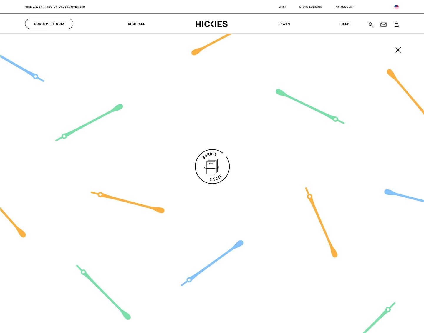
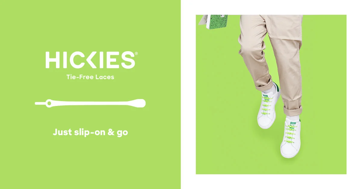
Campaigns ran year-round at HICKIES from seasonal sales to product launches and retail partnerships. Each started with a promotional brief and was developed into static and animated assets across Facebook, Instagram, and retail partner placements in Zalando and Hivewyre.




DIRECT TO CUSTOMER
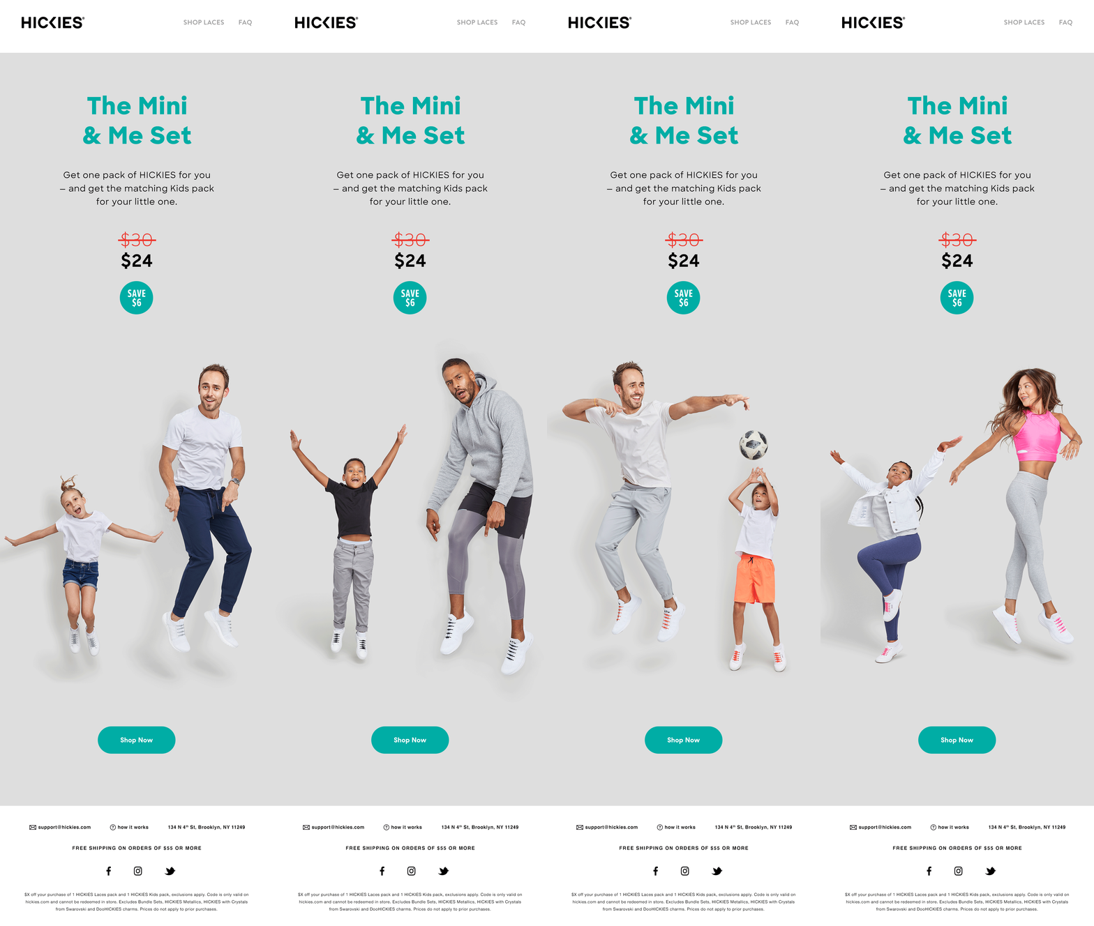
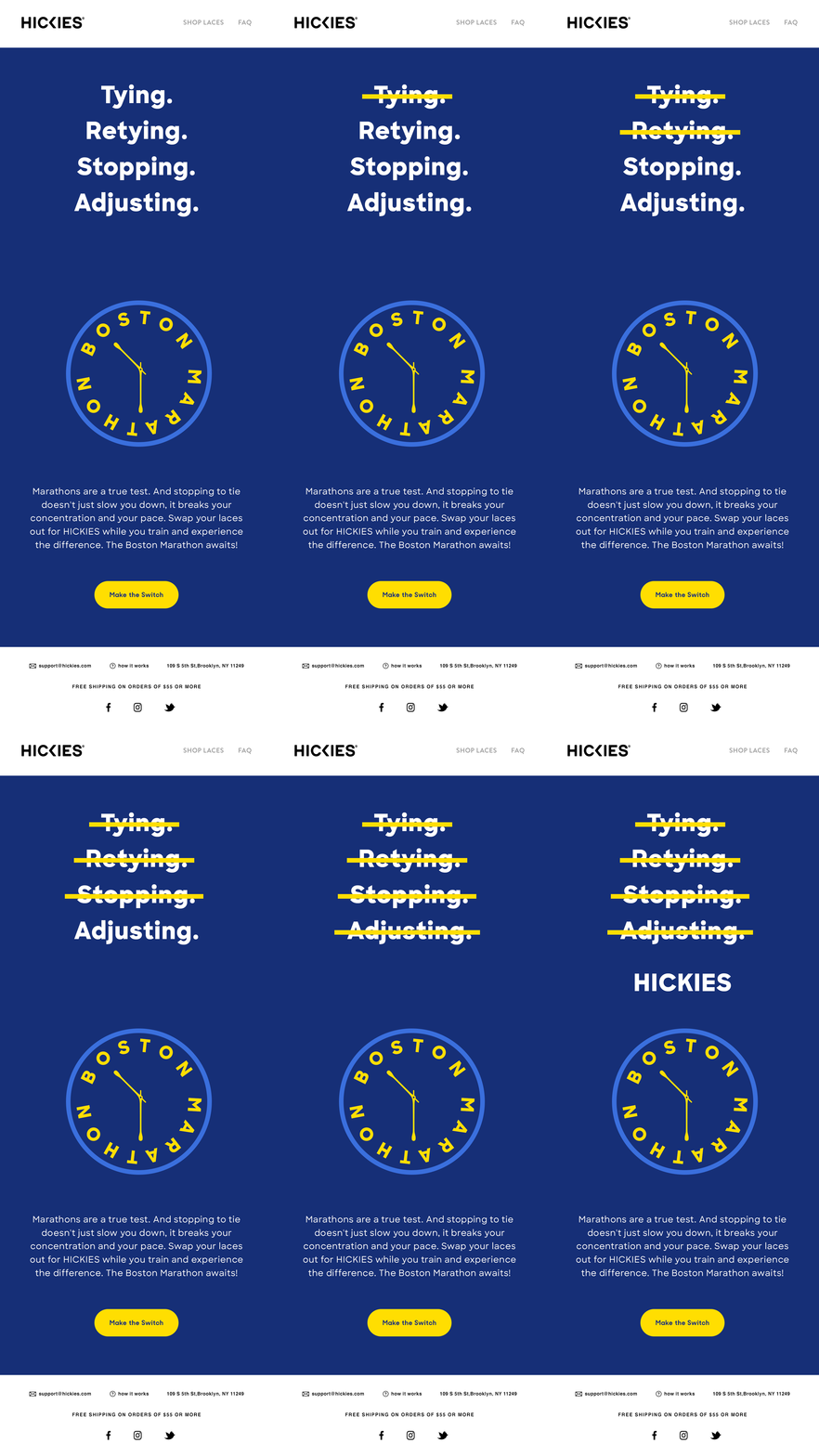
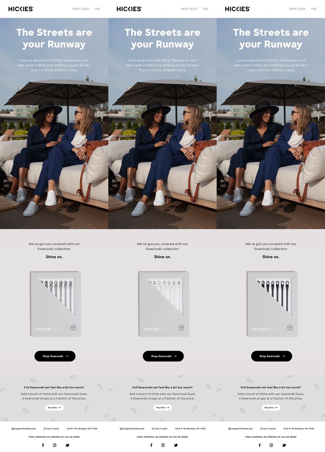
Email Design
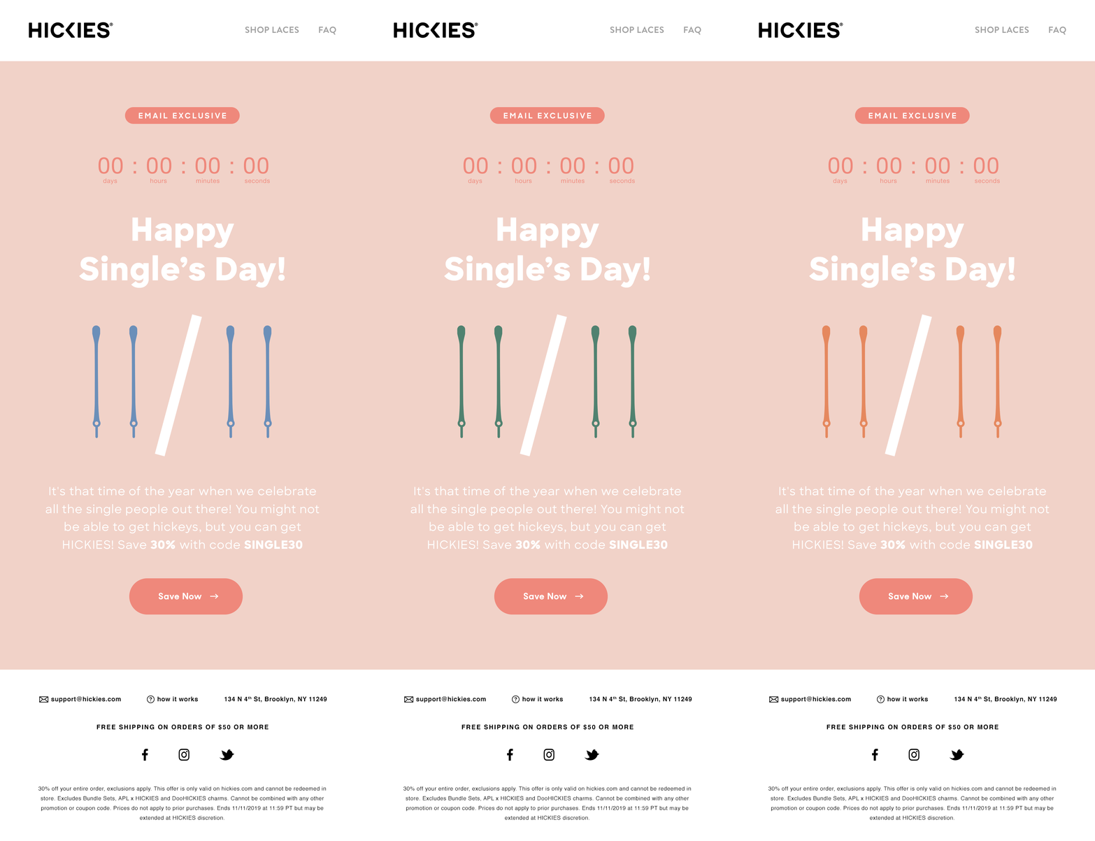
Product launches, colorway drops, seasonal moments, partnerships. Content and timing came from the broader team. The work was organizing that content into a design that felt like a natural extension of the site rather than a standalone broadcast.




SEASONAL STORYTELLING
Valentine’s Campaign
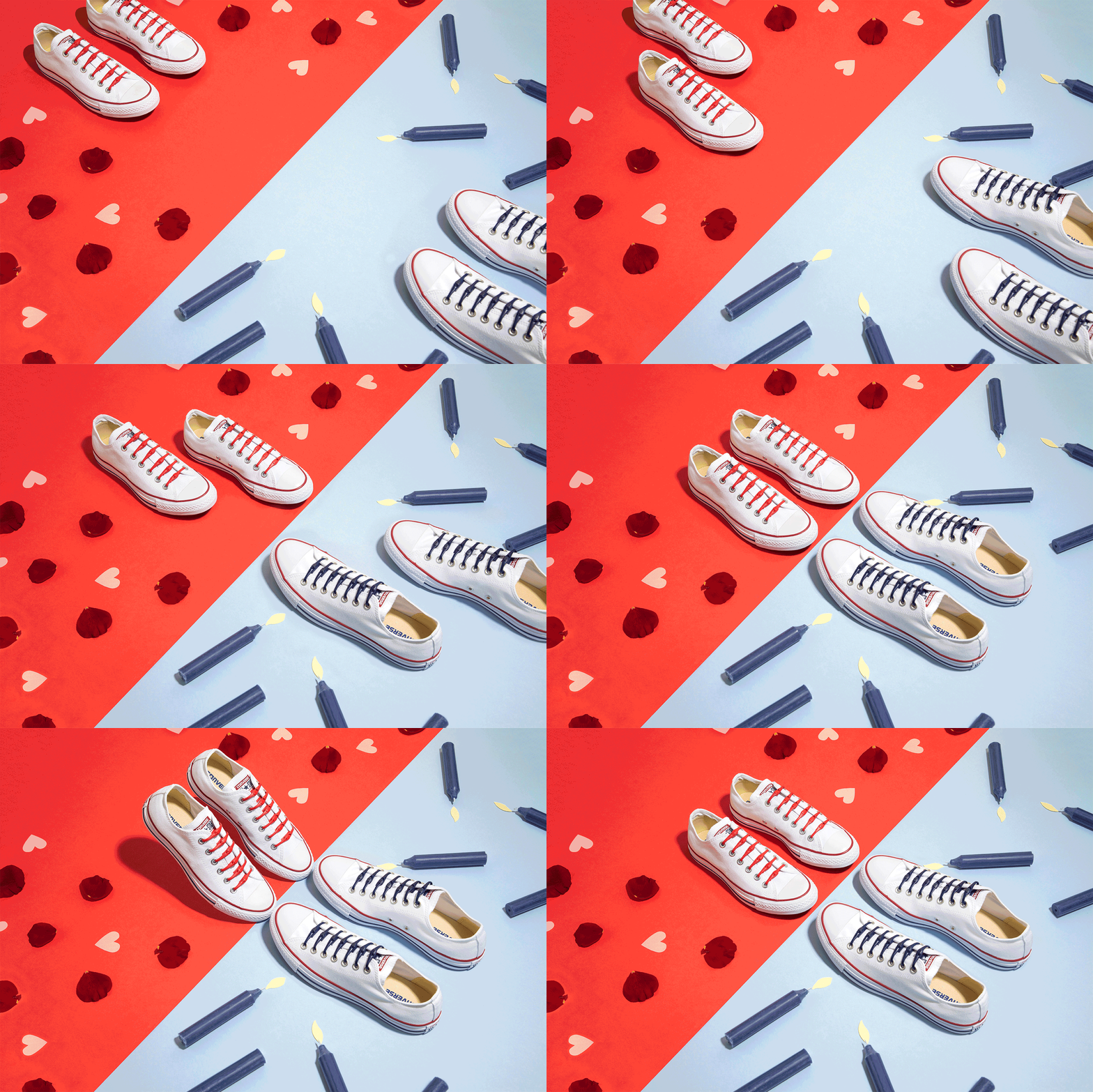
A fully concepted campaign built around three creative territories: Opposites Attract, Single and Fabulous, and Twinning. The creative thread running through all of it was a simple reframe of the shoelace as the ex and HICKIES as the upgrade. Executed across stop motion and static formats.