Case Study - 2023
Student Transportation Portal — Designing for the coordinators who help vulnerable students.
TYPE
Ed Tech / Student Transportation
ROLE
Product Design Contributor, Design Liaison
SCOPE
UX Research, User Interviews, Usability Testing, UI Design, Design System
DURATION
6 months
OVERVIEWA portal for the person in the middle.
This client operates one of the largest alternative student transportation platforms in the country, connecting school districts with service providers that dispatch drivers to move students who can't access a standard school bus. The students they serve include children experiencing homelessness, students in foster care, and students with significant physical and cognitive disabilities. The margin for error is low in every direction.
The product I worked on was the Service Provider Portal: a web application used by dispatchers and transportation coordinators at the client's network of provider companies. Their job is to receive trip offers, evaluate them, accept or decline, assign a driver from their fleet, and make sure the driver has everything they need before leaving the lot. It is coordination work at speed, for students who depend on its seamless service.
I came onto this project as a design liaison, embedded directly with the client's internal design team. The direction and visual system were already established when I arrived. My role was additive: coming in to give the team additional bandwidth, contribute directly to the UI, run the user research that would ground the design in how dispatchers actually worked, and participate as a full team member across sprints and standups.
THE CHALLENGEHigh stakes, moving fast, with no room to get it wrong.
Dispatchers don't work from a quiet desk with time to deliberate. They're managing a full roster of trips across a day, tracking statuses, fielding calls from drivers, and making quick decisions with partial information. The portal needed to support that reality: a dense information environment that still had to be readable under pressure.
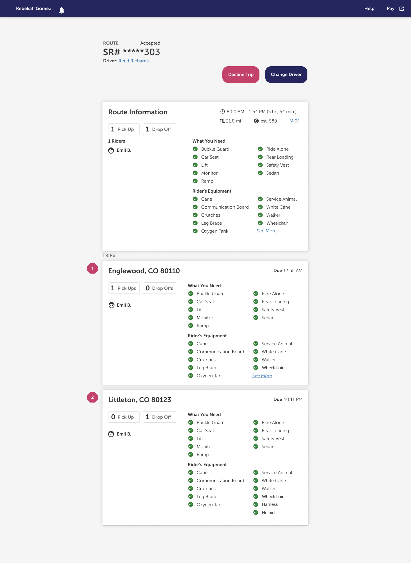
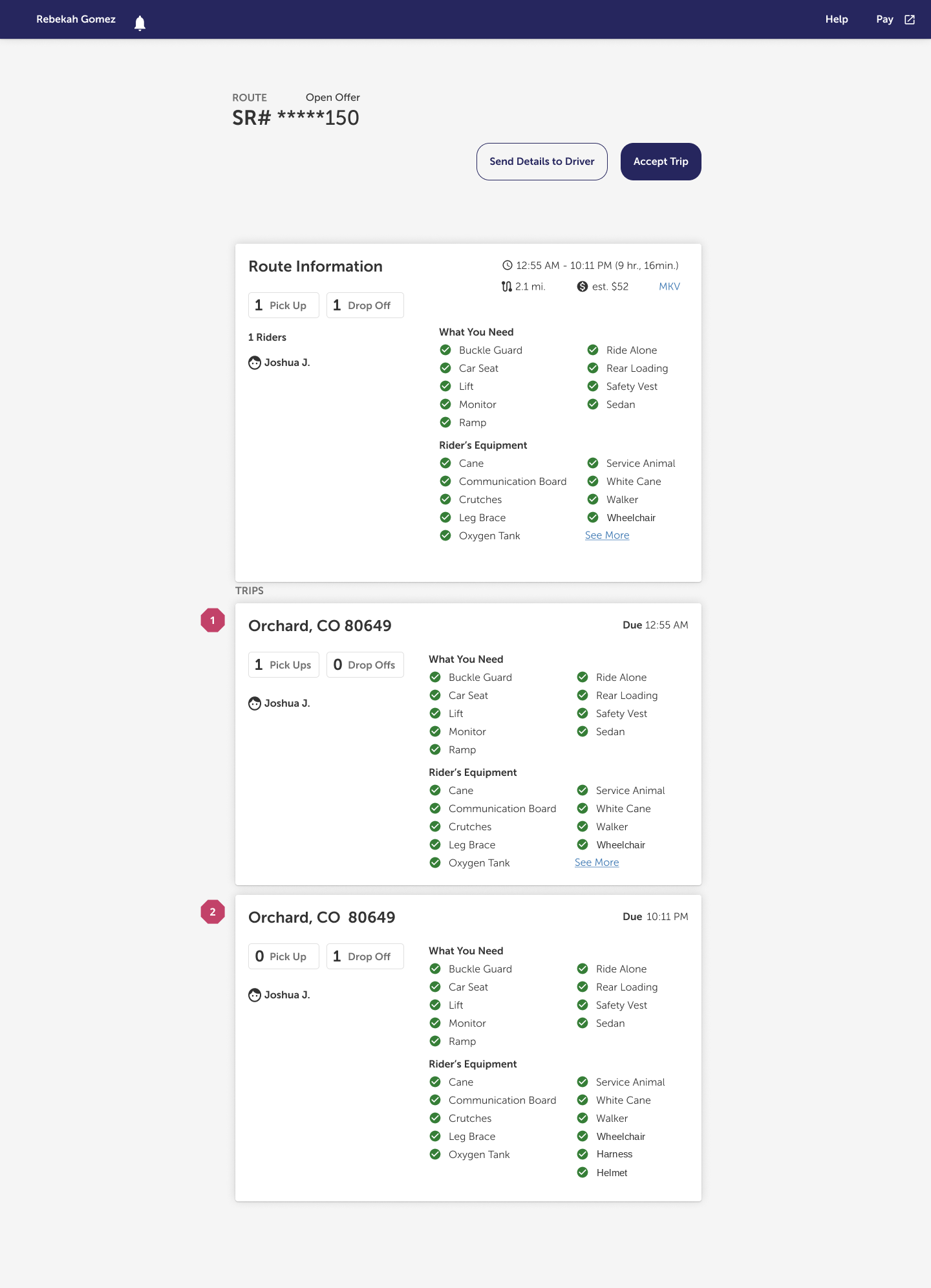
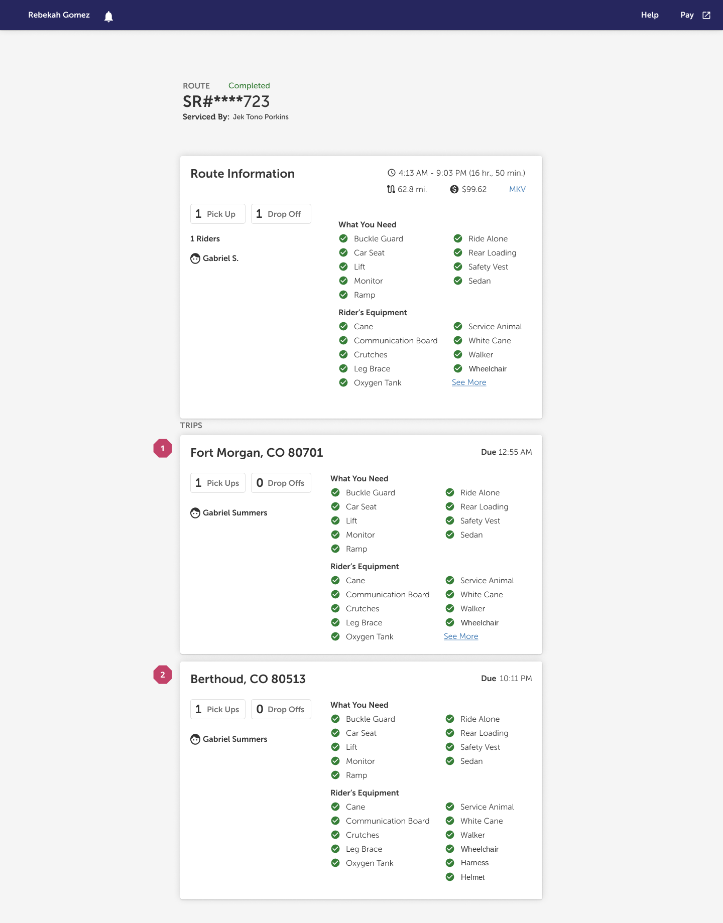
What made this product specifically challenging was the accessibility layer at the center of every trip. Each route carries detailed requirements for the rider it serves: whether they need a lift, a ramp, a buckle guard, a communication board, an oxygen tank, a service animal. These aren't tags or filters, they're the specific needs of a child, and assigning the wrong driver to the wrong trip means that child either doesn't get picked up or gets picked up by someone who isn't equipped for them. The design had to make that information legible without making the entire interface feel like a warning label.
The portal also handles a trip type that flags urgent situations: cases requiring immediate response when a standard trip arrangement falls through. The urgency has to register at a glance without disrupting the flow of the rest of the interface. Getting the visual language right there was its own problem.
APPROACH
Listening before designing.
Before contributing to the design files, I ran user interviews with dispatchers. We wanted to understand how they actually moved throughout a day: when volume peaked and when it settled, what they were watching for when they looked at a list of trips, and where the current system was creating friction they'd stopped noticing because they'd found workarounds for it. We listened more than we asked. Dispatchers who've been doing this work for years know exactly where the pain is. The interview work was about giving them space to show us.
We also ran usability tests against an existing prototype, watching coordinators attempt predetermined tasks and noting where the flows broke down: where they hesitated, where they went somewhere the interface didn't expect them to go, where the mental model they'd brought to the task didn't match what the screen was offering them. Hearing what people said about their work, then watching what happened when they tried to do it, sharpened the decisions the team was working through considerably.
The findings fed directly into information hierarchy and flow decisions: what to surface at the list level versus what to reserve for the details view, how to sequence the driver assignment steps, how to handle the accessibility data per rider in a way that was complete without being overwhelming. The research gave the team a clearer picture of where in the workflow a coordinator needed to move quickly and where they needed to slow down and look carefully, and the design reflects both.
THE WORKThree states. One coherent system.
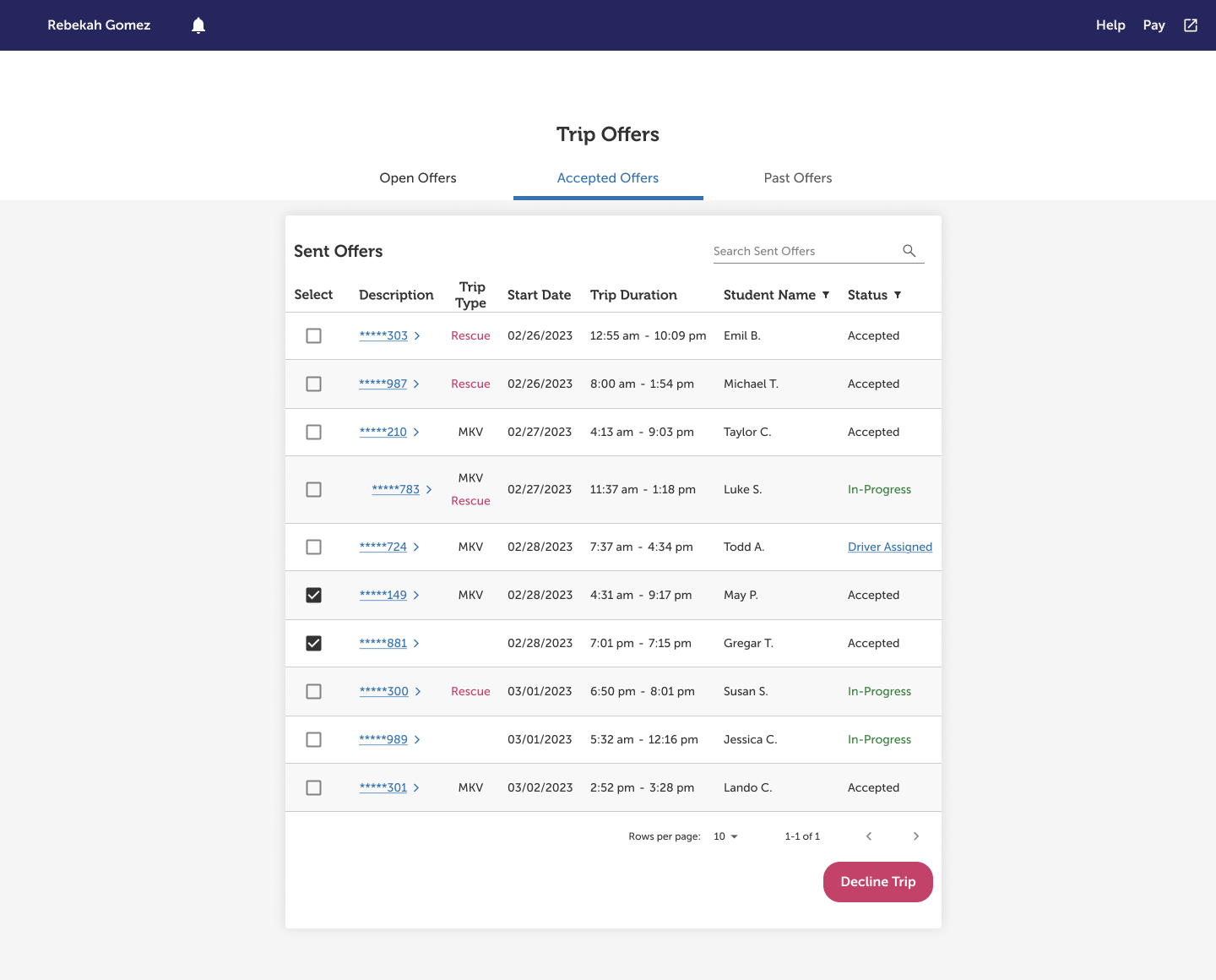
The portal is organized around three states of a trip: offers that are open and available, trips the provider has accepted and is actively managing, and a record of past trips with final outcomes. Each state has different information needs, and the design reflects that at both the list level and the detail level.
The Open Offers table is built for scanning. A coordinator reviewing ten trips needs to make quick calls about which ones fit their capacity: route type, timing, pickup and drop-off geography. The accepted offers view adds driver assignment status to the picture, surfacing where action is still needed. Past Offers carries completion status and the name of the driver who serviced each trip, a record that matters for accountability and performance review.
The details page is where depth lives. It's the place a coordinator goes when a trip needs a real look: the full route breakdown, each stop with its due time, the rider's accessibility requirements laid out in full. The challenge there was organizing that information without making it feel like a form to be checked off. The rider's equipment needs are specific and important; they're also dense. The layout had to make them easy to find without making them the first thing the eye goes to when the page loads.
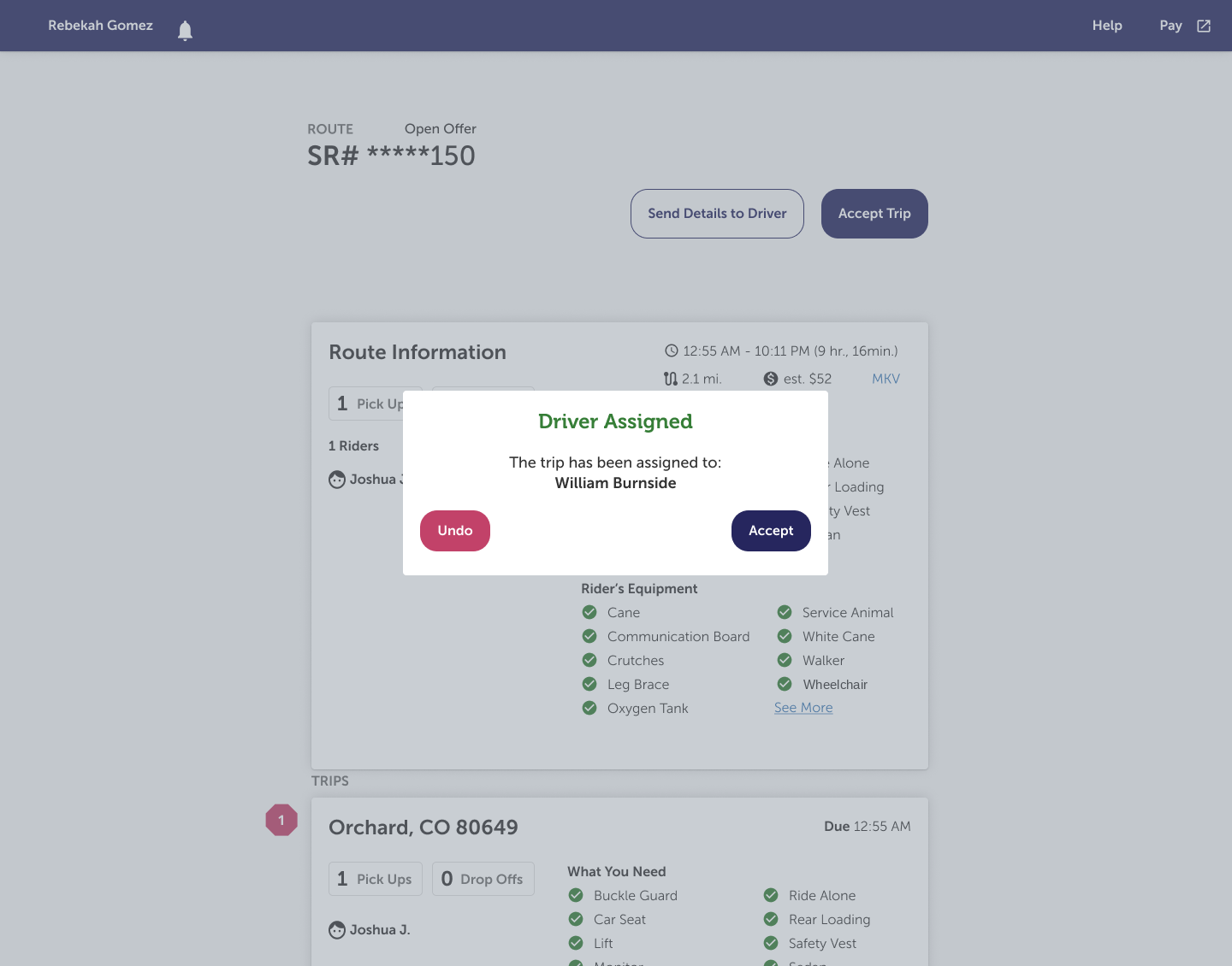
The driver assignment flow runs through a sequence of decisions: selecting a driver, optionally sending trip details before assigning, and confirming the assignment, with a clear undo path if a coordinator catches an error immediately after. Each step in the flow has a confirmation moment specific enough to be useful. The undo state doesn't just ask for confirmation; it tells you who the trip is currently assigned to, so the coordinator is making the decision with the relevant information in view.
The urgent trip type is called out in the interface with a color treatment distinct from standard routes, visible at the list level and on the details page. It doesn't demand attention so much as it answers quickly when you're looking for it. That distinction matters when a coordinator is moving through a full queue and needs to know where the urgent work sits.
I also worked alongside a junior designer on the team throughout the engagement, not just reviewing work but thinking through problems together, talking through the reasoning behind decisions, and being a resource in whatever way was useful, which sometimes was about design and sometimes wasn't.