Case Study - 2023
B2B Customer Portal — Designing for complexity without losing clarity.
TYPE
Consulting, Industrial / Construction
ROLE
Product Designer
SCOPE
UI Design, Design System, Responsive Design
DURATION
5 months
OVERVIEWReplacing a process held together by phone calls.
For a large industrial materials company operating across multiple states, placing a materials order meant going through a sales representative, confirming delivery through a dispatcher, and tracking shipments through whoever picked up the phone. Every interaction lived in someone's inbox or voicemail, with information getting repeated, miscommunicated, or lost between handoffs.
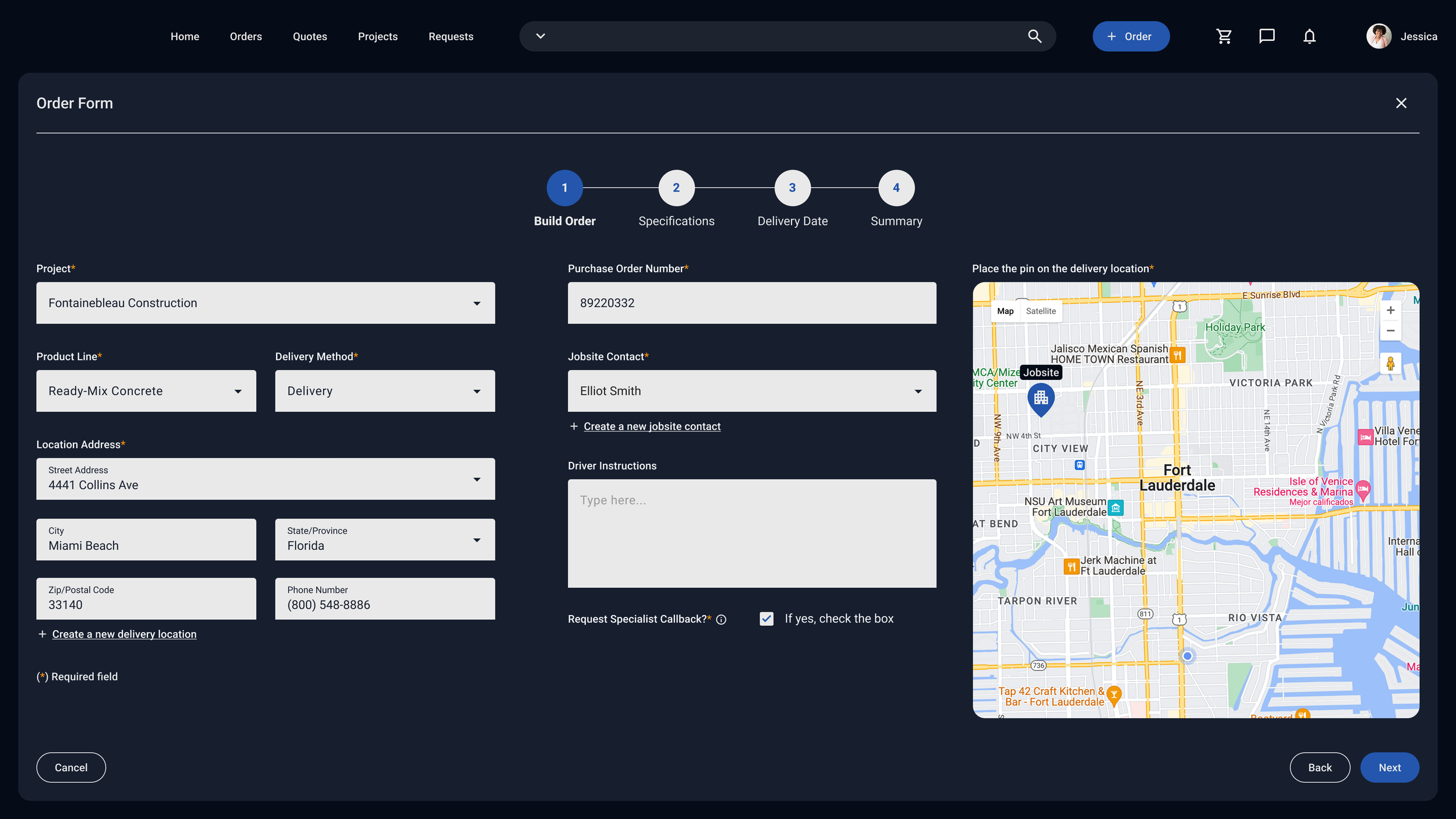
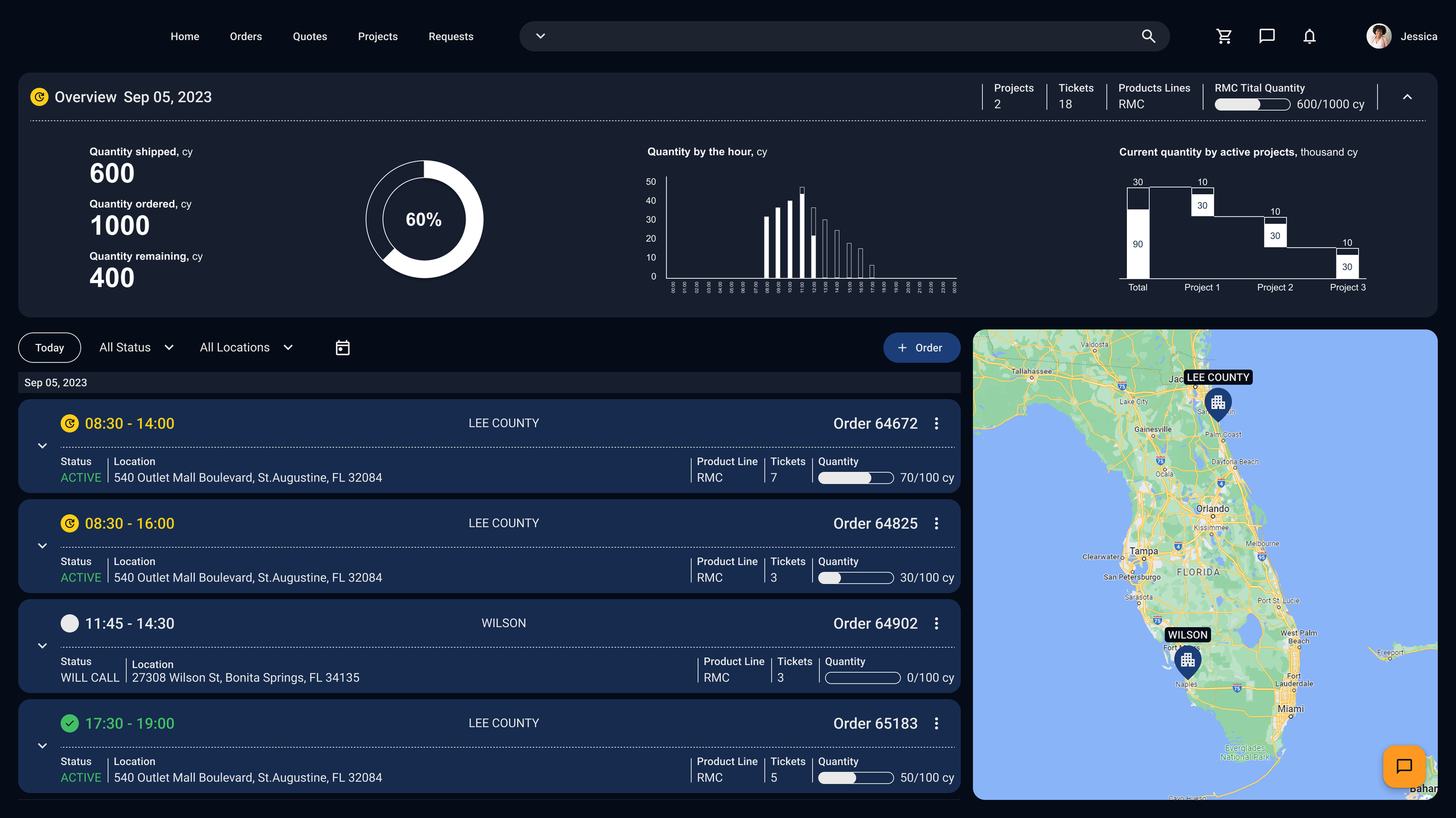
The goal was to replace that with a single digital platform — a customer portal that gave contractors direct access to their orders, their project history, and the ability to place new orders without going through an intermediary. The MVP centered on three things: track an order, view an order, place an order.
THE CHALLENGEA complex operational context where timing actually matters.
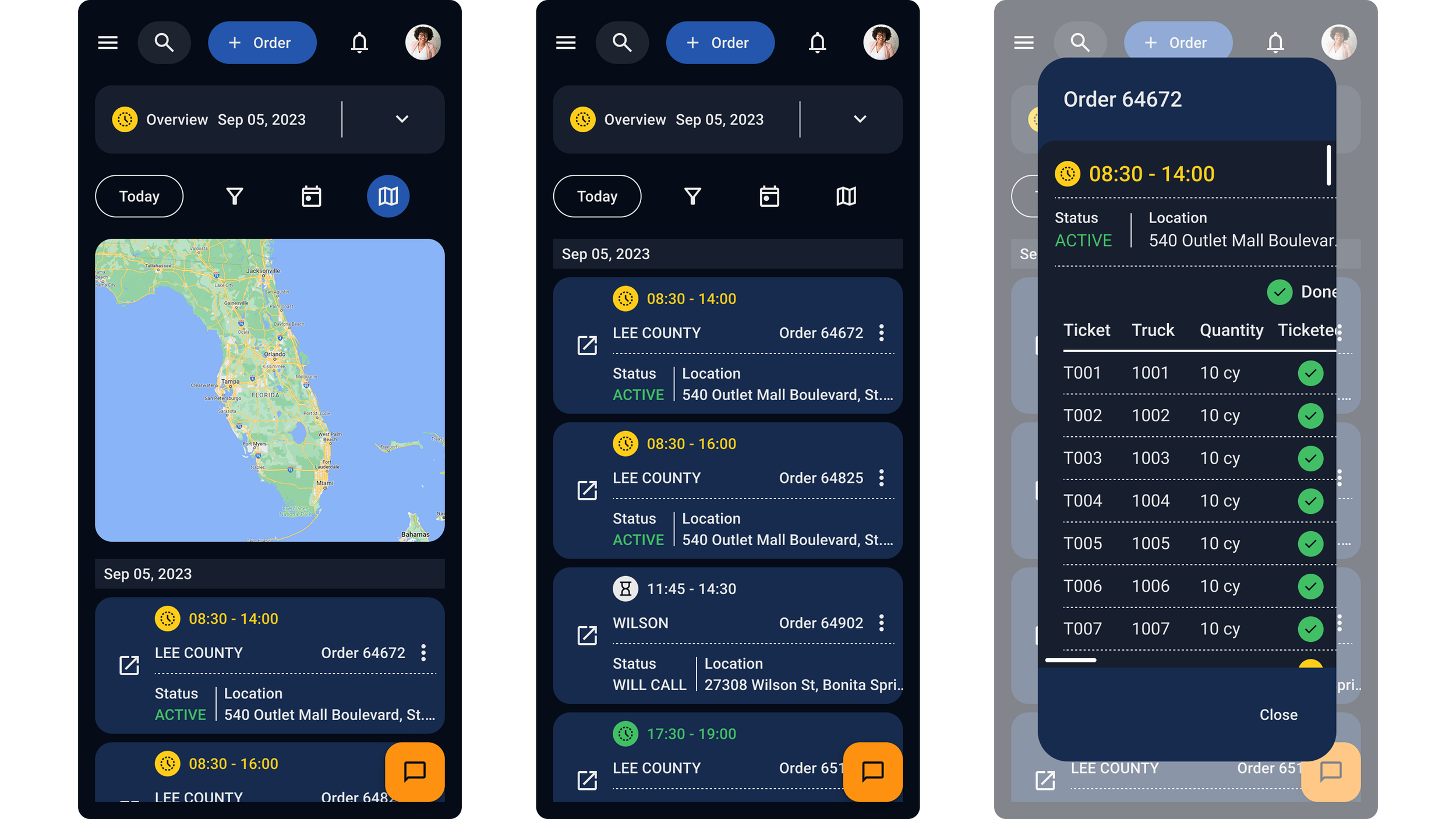
Materials delivery operates on tight windows, and a miscommunicated specification or a missed delivery slot doesn't just create friction — it creates real cost on the job site. The portal needed to surface the right information at the right moment for someone likely managing multiple active orders in the field, not reviewing dashboards from a desk.
The existing brand also needed updating. The client's visual guidelines hadn't been built with digital accessibility in mind, so part of the work was bringing those guidelines forward — building a color system that respected the brand while meeting WCAG AA standards across every component and state.
APPROACHOne sprint ahead, every sprint.
The team worked under Dual Track Scrum — UX running one sprint ahead of development, handing designs off into a live engineering pipeline. It was a collaborative structure that required trust in both directions, with decisions getting made together and made clearly.
I worked as part of a bilingual design team where a senior creative lead set the overall direction. My role was the English-language side of that partnership — working directly with the client, communicating our design thinking in their context, and making sure what we were building felt right for an American contractor audience. It meant listening in two directions at once.
The design system started with the client's existing brand colors and was rebuilt from there. The dark theme gave us the contrast range to meet WCAG AA compliance across the full palette — including the status indicators contractors would rely on most to read their orders quickly. Active, delayed, stopped. Each color was tested against actual background values rather than assumed.
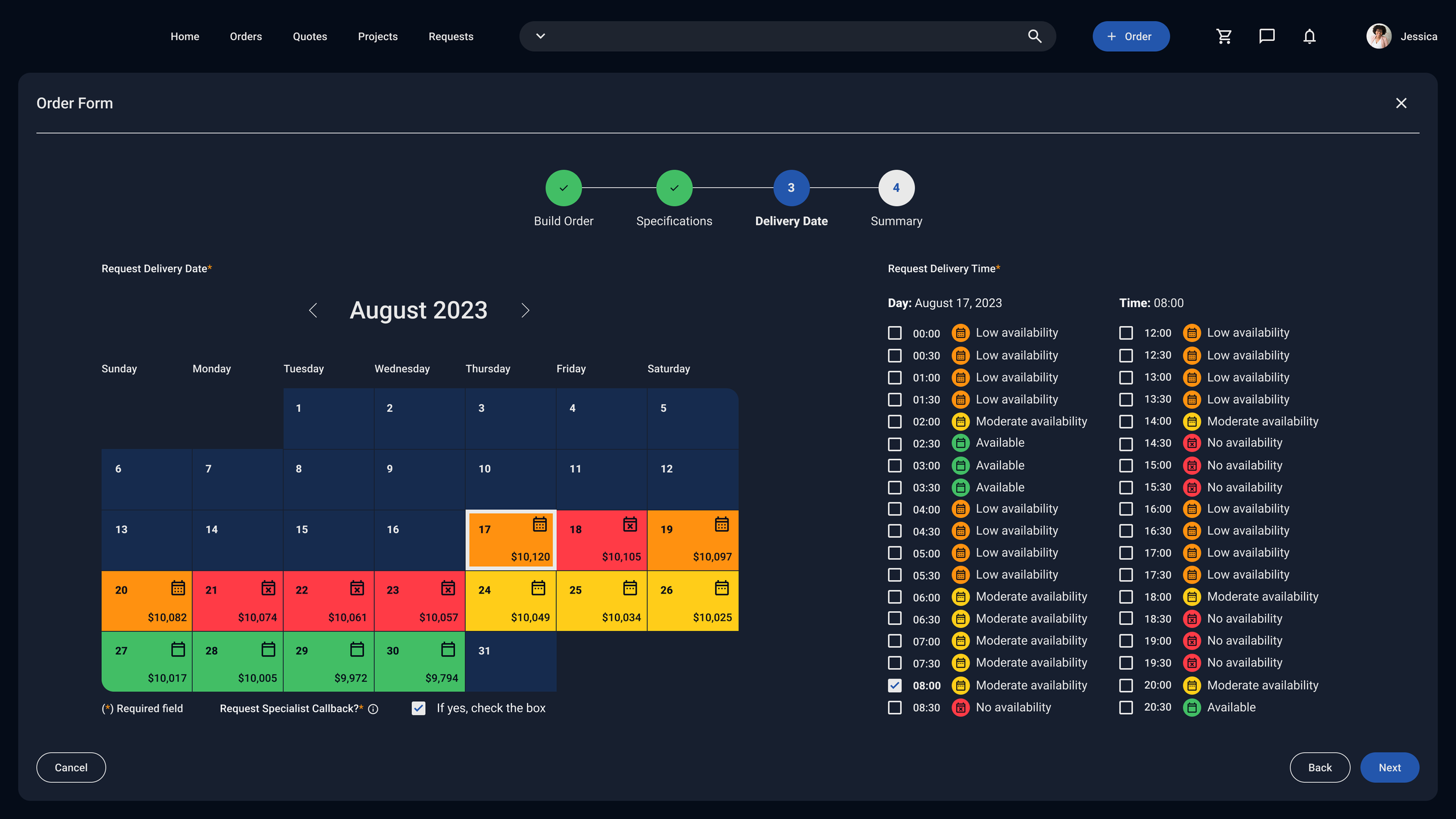
The order flow came together as four steps: build order, specifications, delivery date, and summary. The delivery date screen took the most care, showing real-time availability and dynamic pricing across a calendar view while staying readable for someone checking it quickly in the field. Color, iconography, and information hierarchy all had to carry weight without the screen becoming overwhelming.
The system was built to be responsive across breakpoints, with navigation and layout adapting to each context while the visual language stayed consistent throughout.
THE WORK
From login to order confirmation — production ready.
The deliverable was a complete responsive UI covering login, the order dashboard with live map and order list, the full order placement flow, and order summary. The team ran usability tests with the client's own users during the prototyping phase, validating the home screen approach before development began.
The MVP was the starting point. Communication features, request management, and user administration were all scoped for the phases that followed. What you're looking at is a system designed to grow.